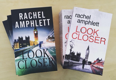
Ever wondered why publishers change a book cover image from time to time?
I thought I’d share a few common reasons why this happens, and why I chose to do so with Look Closer.
Background
I needed a palate cleanse for my creative streak after writing three thrillers in a row (White Gold, Under Fire, and Before Nightfall) and having read crime fiction since I was at school, I felt it was time to do this.
Look Closer has been very well received since its release, and gave me the confidence to go on to write my Detective Kay Hunter crime thriller novels.

Why rebrand a book cover?
For many publishers, it’s a case of keeping up with changing trends in the book marketplace.
- A particular book might take off in a genre, and suddenly a whole rebranding exercise takes place by other publishers to take advantage and offer something similar to readers who loved the bestseller
- The original cover artwork might not appeal to readers, and so the publisher attempts to rebrand the book to encourage sales
- Fonts may fall out of fashion, requiring a subtle update to keep a series on trend
- A single title book might be followed up in later years by a book that means the original story has turned into a series, and so it’s essential to show this message to readers by way of similar book covers.
My reasoning was that I believe Look Closer is a cracking crime thriller that would appeal to readers of my new Detective Kay Hunter series.
Look Closer has garnered fans of its own since its release but I thought that a lot of readers who have enjoyed the Kay Hunter series might not be familiar with my other books. I needed to send a message that Look Closer was similar in style to my Kent-based detective fiction.
Now, the new cover still has echoes of the older version so readers who have already devoured Will Fletcher’s story won’t be confused into buying it again, but those of you who like Kay Hunter will recognise the font used for the title and my name.
It’s the same, but different.
I’d love to know what you think of the new cover for Look Closer – why not let me know in the comments?


Love the new cover and makes it feel more “now” instead of outdated, if that makes sense! The colours pop out of the oage and draws me, as a reader, to the book….but I love covers….?
Thanks, Noelle – yes, I know what you mean. There are so many crime thrillers using this colour combination at the moment that I feel are similar in storyline to Look Closer, I was compelled to make the change. I’m glad you like it!
*page …oops…typing too fast! ?
Lol 😀
Great strategy, Rachel. I love the look your new covers are taking. Good plan to bring Look Closer into the new view and keep the older series with a separate theme. You’re always thinking – that’s why you’re progressing and headed toward a household name!
Ah, thanks Gary! I never stop learning – that’s what I love about this writing malarkey!
I like it!
Thank you!
I love the new cover and it’s a great idea to rebrand, that’s why so many publishers are doing it!
How many covers does the Harry Potter Series have!
Thanks, Veronica – I’m happy to hear you like it. And yes, you’re right – there are a lot of Harry Potter covers around!